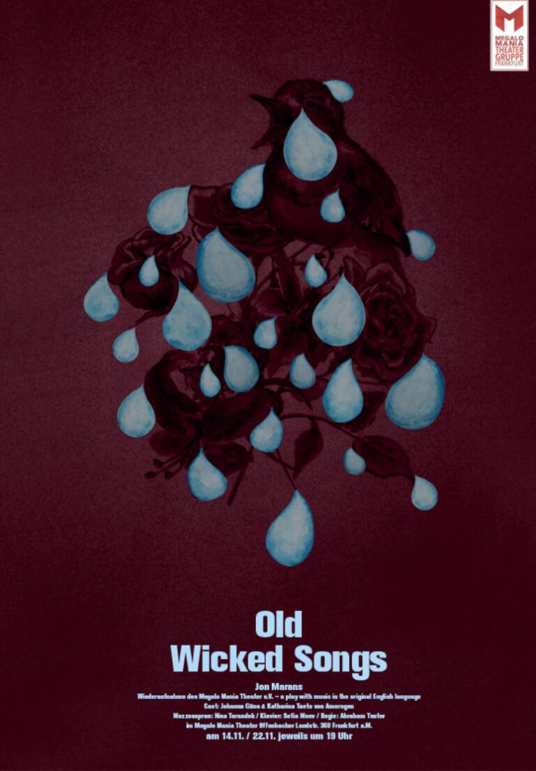
Poster Designs with Megalomania Theatre Frankfurt Main 2015—2021
Poster Designs with Megalomania Theatre Frankfurt Main 2015—2021
Client: Megalomania Theatre Frankfurt Main
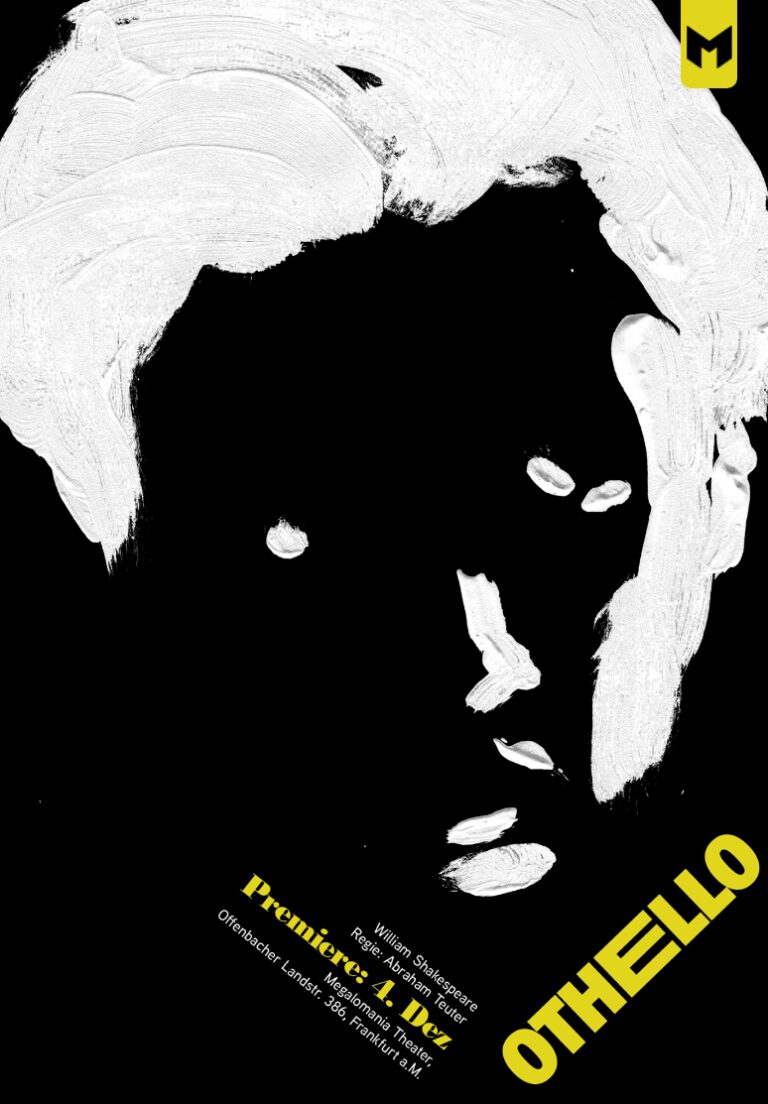
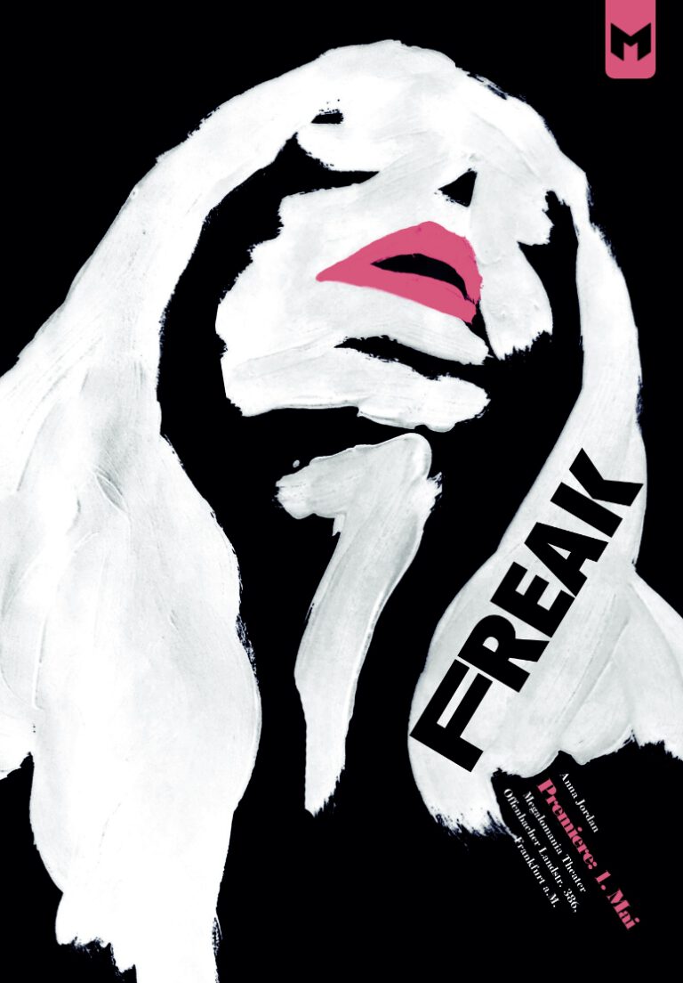
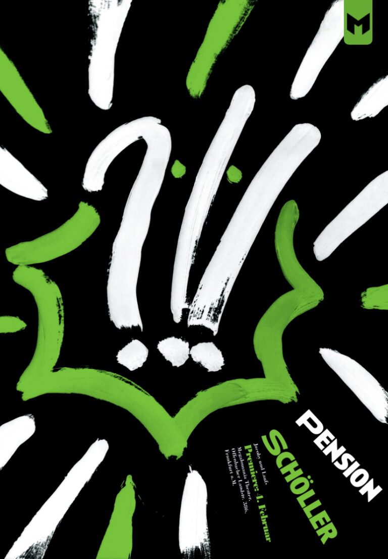
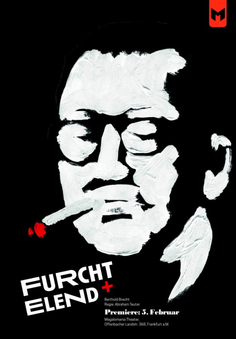
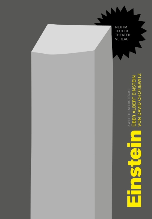
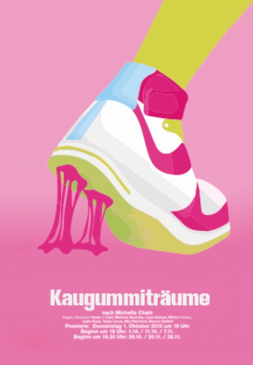
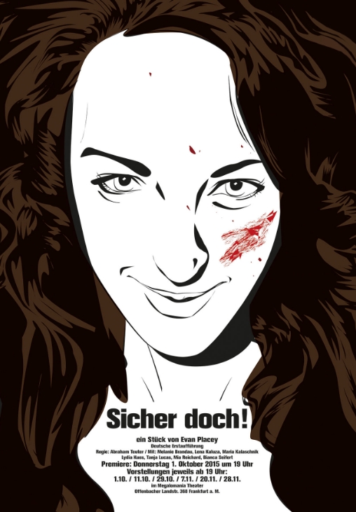
Visual concepts for single plays and whole seasons, performed by a small independent student theatre. This long-time project has a wide scope for visual exploration. As most designs were made before the final cast, stage setting and costumes are set, I had much freedom in creating the posters.
Role: poster designs and layouts
Role: poster designs
Client: Megalomania Theatre Frankfurt Main
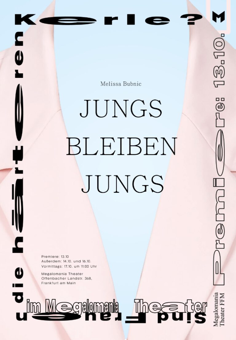
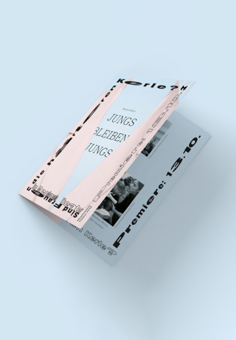
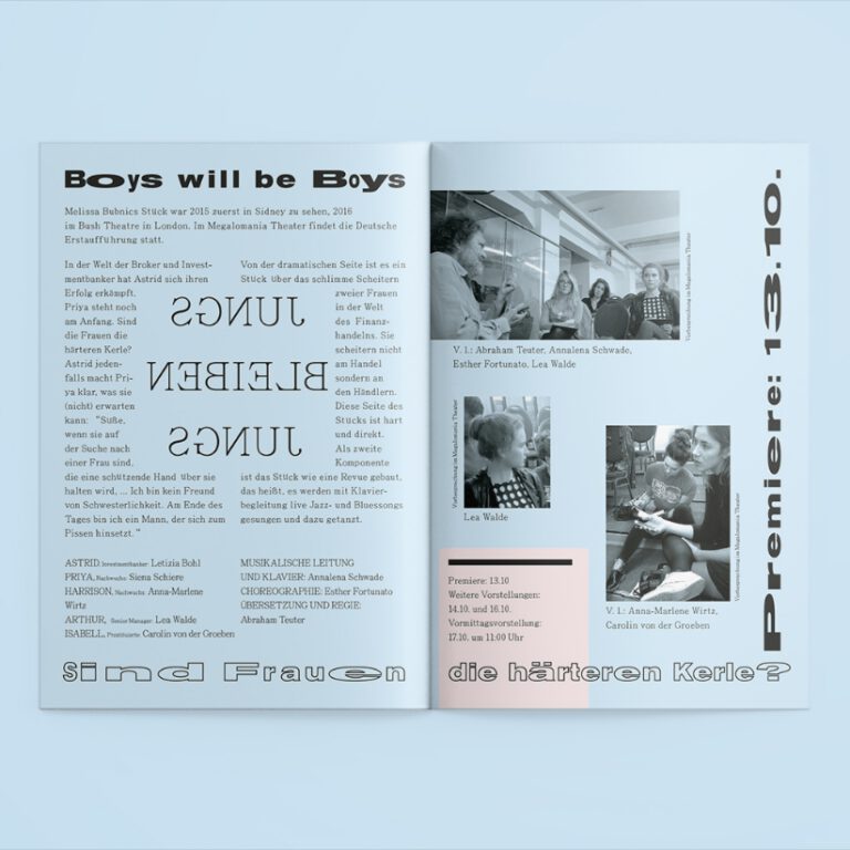
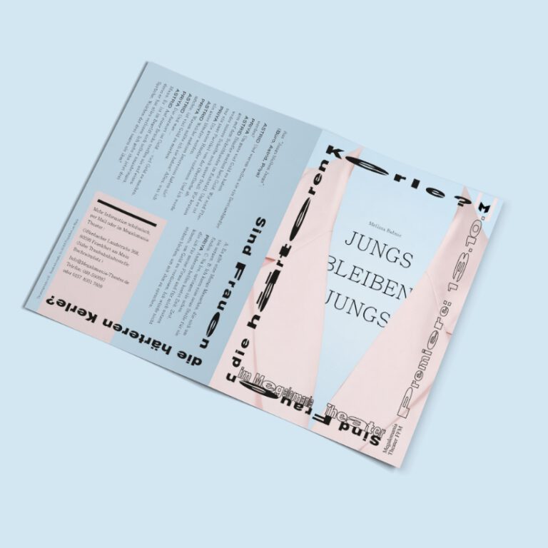
Boys Will Be Boys Poster Design and Flyer
Boys Will Be Boys Poster Design and Flyer
Are women the tougher guys? A play about what women have to do to survive in a misogyny environment. The key visual features a baby pink blazer against a baby blue backdrop, to address the notion of gender determination from birth.
Misch Masch Israel Zangwill's Melting Pot
Misch Masch Israel Zangwill's Melting Pot
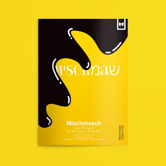
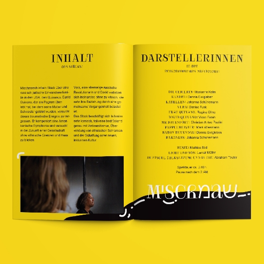
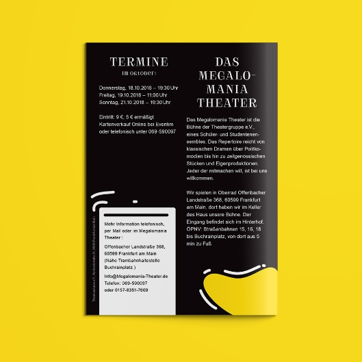
Poster, animation and folder for a play treating the question of how humans of different nationalities, biases and pasts can live together: Israel Zangwill's Melting Pot, Mischmasch in German. Mixing Latin and Hebrew characters, sharp serif and round sans serif, the typographic choice reflects the cultural and attitudinal blend. Whereas the upbeat yellow background, threatening to be eaten by a baleful oily blob, symbolizes the trauma impending to obtain society.
Winter 2015
Winter 2015
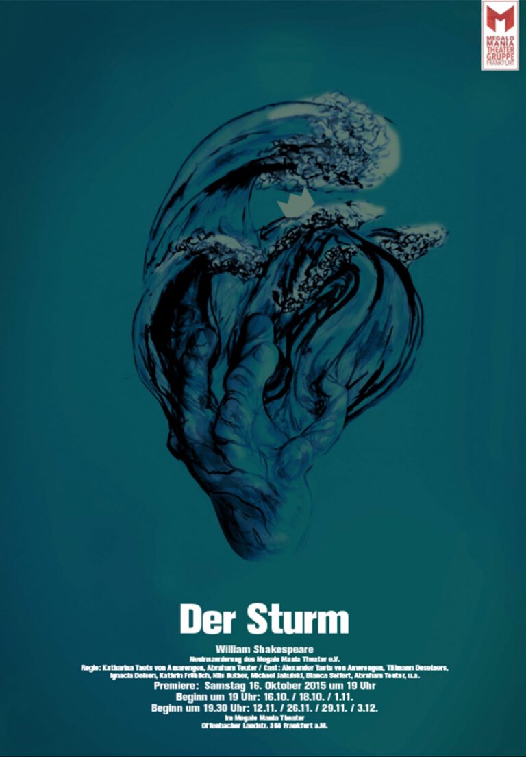
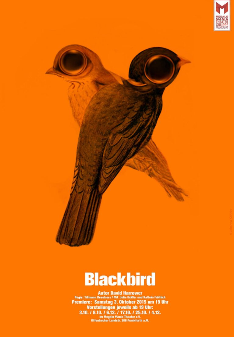
Key visuals for classic and modern plays using pencil drawings and mixed media. A uniform look is achieved by using motifs that are centred within themselves and placed in the middle of the format. The use of typography in various font styles of one family (Akzidenz Grotesk) is a reminiscence of movie titles.
