Brand Design & Webdesign for a New Sales Representative Providing Stones for Oven Manufacturers
Brand Design & Webdesign for a New Sales Representative Providing Stones for Oven Manufacturers
Client: Gruen Feuerfest
Gruen Feuerfest is a sophisticated yet down-to-earth and straightforward emerging sales representative. Providing achievable products with a higher quality standard than most competitors in this price range, they target single professionals as well as buying departments of great plants.
Role: art direction, brand design, webdesign
Role: art direction, brand design, web design
Client: Gruen Feuerfest
To convey Gruen’s grounded approach and quality standard, the logo features a clear, open, and sturdy sans serif accompanied by a rotated G, resembling a flame contained by refractory stone.
The colours in use are ordinary choices in skilled crafts and trades but are valorized by high saturation and darkening gradients.
A Down-To-Earth
And Straightforward
Expert With an Eye for Quality
A Down-To-Earth
And Straightforward
Expert With an Eye for Quality
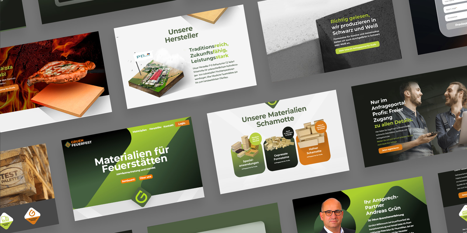
Who, What, How, and Why: The Landing Page as a Digital Business Card
Who, What, How, and Why: The Landing Page as a Digital Business Card
GRUEN mainly approaches new customers in person. Interested parties consult the website mainly to reinforce their buying intention by checking the hard facts and finally to contact GRUEN.
Micro-animations linked to scrolling progress direct users’ attention. Highly saturated images add further value.
Hard facts are spread in easily digestible content sections: sortiment, sales campaigns, manufacturer, closing with the personal point of contact.
Long forms are split into multiple steps. Small animations provide feedback to the customers.

dunkelgruen")